
OPINION: The MyUSF update that no one asked for
To say the changes made to MyUSF are unsettling is an understatement.
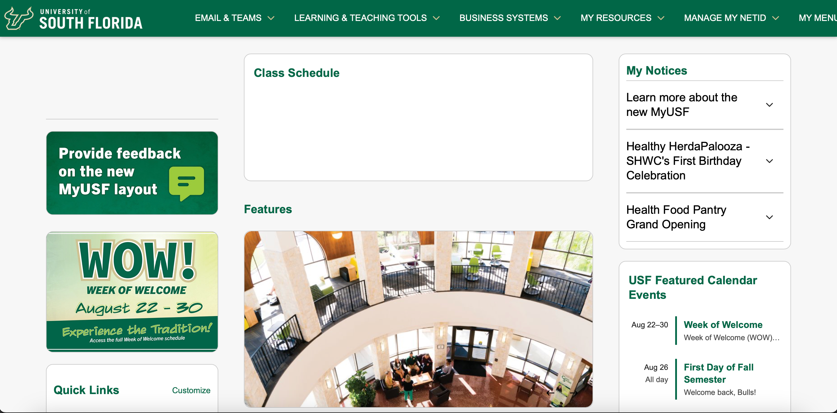
The “refresh” is the first since the COVID-19 pandemic, which is surprising because now MyUSF seems like it hasn’t seen an update in 20 years.
Its new layout downgrade has me wondering: if it wasn’t broken, why did it need fixing?
The first thing I noticed upon loading MyUSF was its color palette, or lack thereof.
What used to be the school’s classic forest green is now replaced with an off white background. The page now feels bland, but still somehow feels overcrowded and chaotic.
Why did we feel the need to make MyUSF a victim of the “sad beige” epidemic?
Related: MyUSF, OASIS websites to get a new look this fall
I love seeing that rich shade of green that we associate with our school. It’s disappointing that we have been robbed of the colorful version of MyUSF.
The changes to MyUSF were meant to provide better communication and organization, said USF spokesperson, Christopher Akin, in a September interview with the Oracle.
When I glance at the website’s redesign, it looks like someone just brain dumped everything they knew about the school’s operations. From our football schedule to Newsroom updates, MyUSF seems to present everything a student could possibly need, all at once.
Opening MyUSF and being presented with my class schedule and upcoming student events just feels like a threat.
A huge appeal of the redesign was that its layout was compatible with smartphones.
“The refresh will allow the MyUSF mobile app to mirror the website,” Akin said. “This means whether users open MyUSF on the mobile app or the desktop version, it will look the same.”
In my opinion, this is where things went wrong.
The layout now is overwhelmed with tabs that mimic smartphone widgets. I don’t want to be able to see everything I could ever do on campus within one page on my laptop.
What looks good and makes sense on a smartphone, does not always translate well into a website format.
The website used to have its most used business systems displayed larger and centered, such as OASIS and BullsConnect. Its older layout made it optimal for students to easily find tabs that we visited most frequently.
But now, we have to play a game of I-Spy just to find what we’re looking for.
“I don’t like the update because I’m so used to the previous MyUSF, so the change is difficult to adapt to when I’m only going to be here for a few more months,” said Taylor Cornish, a senior in pre-law.
Related: Dear USF students, put your phones away
With these changes, it’s also off-putting to see that things aren’t where I am used to them being.
“Right now the update is confusing but just because it’s different. I just need to get used to it, then it’ll feel more organized and easier to navigate,” said Olivia White, a senior in creative writing.
I will miss the MyUSF webpage that I spent knowing most of my college experience. I have the muscle memory ingrained in me to click on the parking tab to pay off my parking violations.
Even though it’s called MyUSF, I no longer claim it.
More Stories

OPINION: Hey USF, stop swiping on Tinder and start making real connections.
Let’s be real. Dating is hard. I have tried almost every dating app. Tinder, Hinge, Bumble, you name it, and honestly, it didn’t work. I deleted dating apps two months ago to start focusing on myself and my goals. But I realized three years too late that these platforms don’t normally lead to real-life connections. […]

OPINION: USF puts the A+ in advice
Preparing for exams, a never-ending Canvas to-do list and the continuous notifications that something has been graded. This, in a nutshell, is the typical college student experience in November. It’s easy to feel alone as you check your grades and overhear your classmates’ successes. But students at USF are here to tell you this is […]

OPINION: My top picks for USF’s Roundup Comedy Show
Last Tuesday, comedian Trevor Wallace graced the Yuengling Center stage for the annual Roundup Comedy Show. Other notable comedians to visit our campus include last year’s performer Joe Gatto from Impractical Jokers, Nick Cannon in 2015 and Pete Davidson in 2017. This got me thinking. What other comedians should host our next comedy show? Related: […]

OPINION: USF has a woman president. It’s time the U.S. did too.
It’s 2024. Women are doctors, lawyers, pro-athletes and pilots, but a woman still has yet to be the President of the U.S. USF appointed its first woman president, Betty Castor, in 1994. The university is among many institutions in the country that recognizes the value of women serving in leadership roles. Related: Donald Trump’s win prompts […]

OPINION: USF students might be divided, but let’s keep things civil
As Election Day wrapped up on Tuesday, tensions were high. Throughout the country, reported threats of violence were abound. Voters anxiously awaited results throughout the night and into Wednesday. Former Republican President Donald Trump won the 2024 presidential election after he claimed the 270 electoral votes needed to win the presidency, according to the Associated […]

OPINION: It’s time to clock out USF
Fifty hours a week, no sleep and an empty stomach became my new normal. But it wasn’t always this way. I started at Tijuana Flats when I was just a freshman in college as a full-time student. It was a way to make a few extra dollars but I treated it like it was the […]